WORLD RESOURCES
FOR REVIEW & APPROVAL
The following videos explain the work done to refresh the current brand logo. The challenge was to move the look forward without going far enough to be unrecognizable to current customers, partners and internal team, but to still clean it up and streamline what we have and need for immediate use.
OPTION 1:
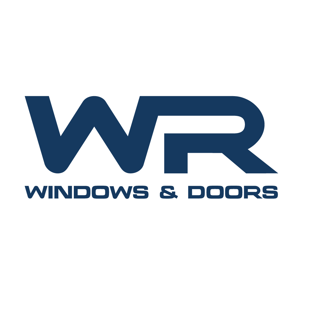
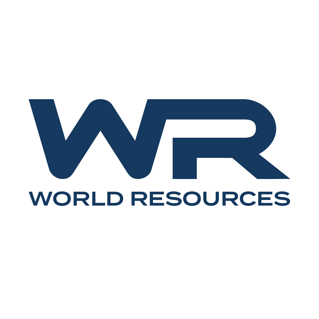
WHAT NEEDED TO BE ADDRESSED WITH THE ORIGINAL.
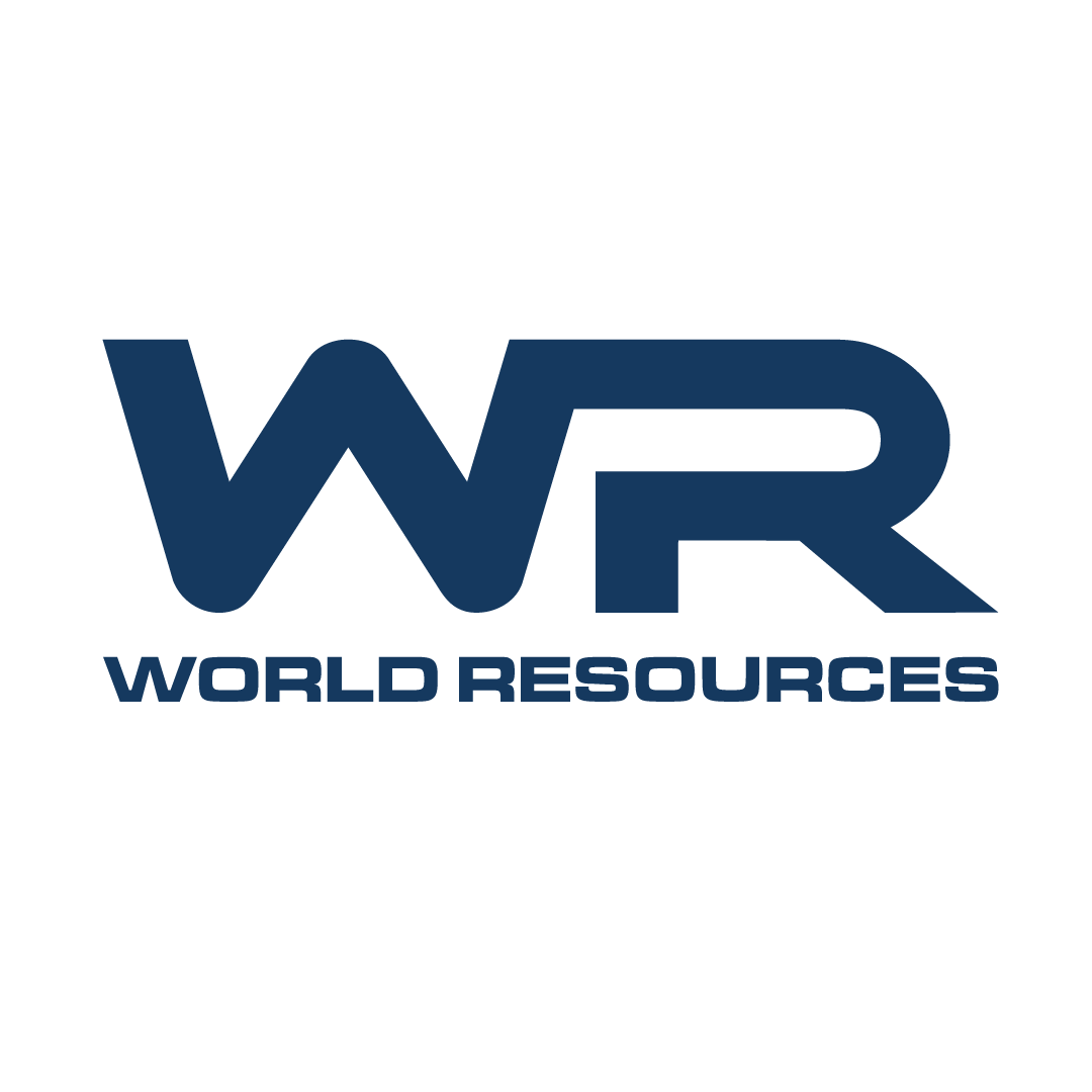
OPTION 2:
WITH ALL URGENT EDITS COVERED - PUSHING FURTHER WITH TO BETTER TIE THE WR ABBREVIATION WITH THE FULL NAME BENEATH IT.
OPTION 3:
FINE TUNING THE FONT WITH CUSTOMIZATIONS FOR BETTER LEGIBILITY.
OPTION 4:
EXPLORING A NEW FONT ALTOGETHER.
BONUS ROUND - OPTION 5:
PUSHING AHEAD AND SEEING THE POSSIBILITIES.
Option 1
-Cleans up the logo, keeping the current fonts, but addressing all the shape imperfections and lack of shared x y planes.
Option 2
-Carries over all those heavy, detailed up front updates made to Option 1 and brings in custom font work for the full name.
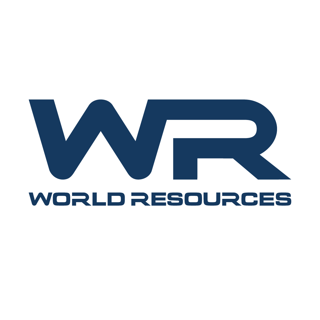
Option 3
-Carries over from option 2 and improves legibility on the full name with additional customization to the letter shapes in the name.
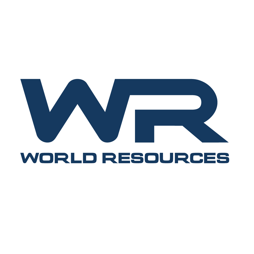
Option 4
-Offers a new complementary font for the name.
BONUS -Option 5
-Shows us what it looks like to carry on with the main WR monogram logo but drop the name and replace it with a direct, clear purpose.
THAT'S ALL FOLKS
✌️
THAT'S ALL FOLKS ✌️